Slow load times, confusing navigation, weak CTAs, and ignoring mobile users are just a few website design mistakes that could be killing your conversions. Learn how to fix these issues and optimize your site for more leads, better user experience, and higher engagement!”
Your website should be your #1 lead generation tool, but if you’re not getting conversions, something’s wrong. Many businesses struggle to turn visitors into customers simply because their site has poor design choices.
From slow loading times to weak CTAs, these common mistakes drive potential customers away instead of pulling them in. Let’s go over four major website design mistakes and how you can fix them to start generating more leads.
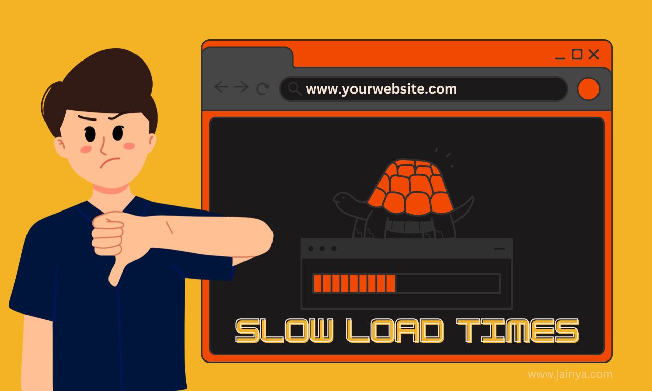
1. Slow Load Times: The Biggest Conversion Killer & How to Fix It
You click on a website, and it takes forever to load. What do you do? If you’re like most people, you hit the back button and find a faster alternative.
Speed matters—47% of users expect a page to load in two seconds or less, and every extra second increases the chance they’ll leave.
What’s Slowing You Down?
- Large, unoptimized images that take too long to load
- Too many plugins or bloated code slowing down performance
- A cheap hosting provider that can’t handle traffic efficiently
- Not using caching or a Content Delivery Network (CDN)
How to Fix It
- Compress images without losing quality using tools like TinyPNG or ShortPixel
- Minimize plugins and remove unnecessary scripts slowing your site down
- Upgrade to a reliable hosting service with faster server response times
- Enable browser caching and use a CDN like Cloudflare to speed up global access
When your website loads fast, visitors stick around, increasing your chances of turning them into customers.
2. Confusing Navigation: Why Visitors Leave & How to Create Clarity
Ever landed on a website and felt completely lost? You just wanted to find pricing, but the navigation was cluttered, confusing, or downright impossible to follow. Bad navigation frustrates users and makes them leave before they even see your offers.
Common Navigation Mistakes
- Too many menu items that overwhelm visitors
- Hidden or hard-to-find menus on desktop or mobile
- No clear hierarchy—important pages buried under unnecessary links
- No search bar, forcing users to hunt for what they need
How to Make Navigation Easy & Intuitive
- Keep menus simple—5-7 main items max for easy scanning
- Make sure the menu is visible and accessible across all devices
- Use clear, descriptive labels—avoid vague terms like “Services” or “More”
- Add a search bar to help visitors find what they need instantly
Good navigation removes friction, helping visitors find exactly what they’re looking for without frustration. And happy visitors become paying customers!
3. Weak Call-to-Actions (CTAs): Designing Buttons That Actually Work
A Call-to-Action (CTA) is what tells visitors what to do next. Without a strong CTA, your visitors will scroll around and leave without ever taking action. A weak CTA is one that’s too small, too vague, or simply not convincing enough to get clicks.
What’s Wrong with Your CTA?
- Generic wording like “Submit” or “Click Here” (yawn!)
- Poor color contrast—buttons that blend into the background
- Unclear messaging—users don’t know what happens next
- Not placed where users naturally look for it
How to Make CTAs Work
- Use action-driven, benefit-focused text like “Get Your Free Quote” or “Start My Trial”
- Make sure buttons stand out with bold colors and high contrast
- Place CTAs above the fold and at the end of key sections
- Use urgency or social proof—“Limited Spots Left” or “Join 5,000+ Happy Customers”
A great CTA makes it easy and compelling for visitors to take the next step, whether that’s signing up, booking a call, or making a purchase.
4. Ignoring Mobile Users: How to Create a Mobile-First Experience
If your website isn’t mobile-friendly, you’re losing half your audience—literally. Over 55% of web traffic comes from mobile devices, and Google prioritizes mobile-friendly sites in search rankings. If your site isn’t optimized, visitors struggle to navigate, pages load awkwardly, and they leave within seconds.
Common Mobile Design Mistakes
- Tiny text and buttons that are impossible to tap
- Content that doesn’t resize properly on different screen sizes
- Slow mobile load times because of heavy images and excess code
- No easy way to contact or buy from your site on mobile
How to Fix Your Mobile UX
- Use responsive design so your website adapts to any screen size
- Ensure buttons and links are big enough to tap with a thumb
- Prioritize fast-loading pages—Google recommends under 3 seconds
- Make sure forms and checkout processes work seamlessly on mobile
When your site works well on mobile, you capture more leads and give visitors a better experience, no matter where they are.
Final Thoughts
A high-converting website doesn’t just look pretty—it’s built for usability, speed, and engagement. By fixing these mistakes, you’ll create a site that’s faster, easier to navigate, and optimized for mobile users. That means more leads, more customers, and more revenue for your business.
Want to take your website to the next level? Start implementing these best practices for website design to generate more leads & customers and watch your conversion rates skyrocket!
Leave a Comment